


 Text Styles
Desktop
| H1 | Avenir Next Bold - 56dp |
| H2 | Avenir Next Bold - 45dp |
| H3 | Avenir Next Bold - 36dp |
| H4 | Avenir Next Bold - 30dp |
| H5 | Avenir Next Demi Bold - 24dp |
| Lead Text | Avenir Next Regular - 20dp |
| Body Bold | Avenir Next Bold - 16dp |
| Body Regular | Avenir Next Regular - 16dp |
| Body Small | Avenir Next Regular - 14dp |
| Body X-Small | Avenir Next Regular - 11dp |
| Huge button label | Avenir Next Regular - 26dp |
| Big button label | Avenir Next Regular - 20dp |
| Standard button label | Avenir Next Regular - 16dp |
| Text-only button | Avenir Next Regular - 20dp |
| Links | Avenir Next Regular - #00B1FF |
Mobile
| H1 | Avenir Next Bold - 30dp |
| H3 | Avenir Next Demi Bold - 26dp |
| H5 | Avenir Next Demi Bold - 20dp |
| Lead Text | Avenir Next Regular - 20dp |
| Body Bold | Avenir Next Bold - 16dp |
| Body Regular | Avenir Next Regular - 16dp |
| Body Small | Avenir Next Regular - 14dp |
| Body X-Small | Avenir Next Regular - 11dp |
| Button label | Avenir Next Regular - 16dp |
| Text-only button | Avenir Next Regular - 20dp |
| Links | Avenir Next Regular - #00B1FF |
Colors
UI primary palette

UI secondary palette: alerts
 Grids
Grids

Desktop > 1366 x 768
Desktop < 1366 x 768
Mobile
Spacing

Narrow spacing is used between elements of the same section
Wide spacing is used between different sections
Buttons
Huge Size

Big Size

Small Size

Buttons dimensions
The length depends on the text label inside plus the margins as indicated by the scheme on the right.

Buttons colors
Pay particular attention on each use case. All options have a specific use and purpose.


Transparent buttons
In some occasions, a more subtle call-to-action is necessary. Buttons without container are underlined with the brand gradient. The gradient is animated on mouse-over (pink moved to the right, blue appear on the left)
 Icons
Icons
Desktop Size
Icons are always drawn only by stroke lines.
Biggest dimension contained in a 24x24dp square.
Stroke thickness:1dp
Notification:
6x6dp, color #FF0088
Mobile Size
Icons are always drawn only by stroke lines.
Biggest dimension contained in a 18x18dp square.
Stroke thickness:1dp
 Images

Images that are not full width can have a “gradient shadow” behind.
If the image links to another page (for example on the featured products) the shadow appears when the mouse is over.
If the image does not contain any link, the shadow appears when scrolling down the page.
Shadow offset: 16px right, 16px bottom
Never overlap text, buttons and the main subject of the visual, with external elements (badges, banners, etc).
On branded sites (hihonor.com, honor.jd.com, etc) where the logo is already on the header of the page, never use the HONOR logo on banners.
 Forms
Forms
Input stroke: 1px, color #000000
Placeholder text: style Lead Text, color #9B9B9B

Error message
Error messages are displayed under the input field where the error occured. The stroke of the field change color.
Font style Small, color #FF00D0

Confirmation
Confirmation status is represented by the Submit button becoming round and changing color to #00B1FF with a checkmark icon in.
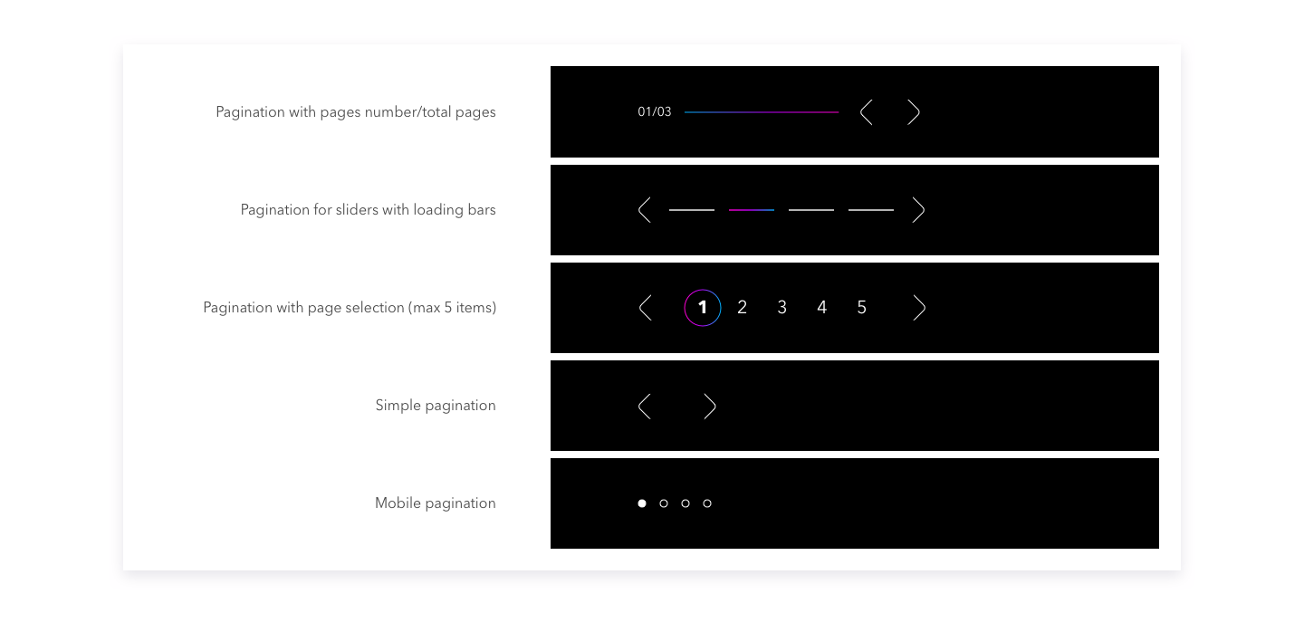
 Pagination
Thanks for checking this out!

TOP